
SuperSearch — find fonts by contrast, x-height and weight!
Finding the right font between thousands can be hard. We made it simple by analyzing multiple optical font characteristics.
Finding the right font can be hard, especially if you're a designer with a few thousands of them on your hard drive. Most of us (designers) need a way to find the correct font for a particular task and this can be difficult without the correct tools or the correct information. Some might think that each font has all of its characteristics, like thickness, contrast, serifs or no serifs, "included" inside of it, but this is only partially true.
Some font designers might choose to include these details in their fonts, others might simply forget to do it. Some might call a cursive font variation "italic", others might call it "slanted". There is no single system in place to categorize all the fonts and there are no strict rules to be followed. This creates the problem of inconsistent font classification and, emerging from this, the problem of inconsistent font search. What can we do, huh…
Turns out, we actually can do something! Introducing: SuperSearch 🔥
We have decided to implement a consistent font classification and search method that would be independent from all pre-written font parameters and would use the real optical font characteristics as a basis. Actually, the idea is not even new: Adobe Fonts does something similar where you can search fonts by weight, width, x-height and contrast, with three options available in each category. But the real inspiration for our solution was the article "The Anatomy of a Thousand Typefaces" by Florian Schulz. You should really give it a read — it describes all the aspects of this classification approach, so we are not going to discuss it here in full detail.
The problem with font providers, like Adobe, is that they classify fonts in-house (maybe even manually, sigh) and it applies only to fonts offered by them. In FontBase, on the other hand, we do this automatically for any font you add into the app. It is processed right after adding and you can immediately find this specific font by its optical characteristics (like magic).
Let's take a quick look at what we measure in each font and how we do it.
- X-height. This one is easy: it's the relation between lowercase x and uppercase X. The bigger the number, the smaller the difference, which means the lowercase is bigger compared to uppercase letters. 1 means we have an all-caps font.
- Weight. To calculate weight we determine the relation between the overall font glyph area and its filled area. The more of the area is black, the heavier the font, and the bigger the weight.
- Contrast. This one is tricky, as we determine the relation between thin and thick parts of a glyph. The bigger the number, the bigger the difference, so the font has higher contrast. 0 means that glyphs are squares.
- Proportion. The relation between glyph height and width. The bigger the number, the more stretched the font is. Lower numbers correspond to a condensed font.
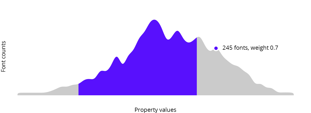
And the best part: we plot all the results and font counts on a pretty chart where the distribution of fonts is clearly visible and you can select a search range for each parameter. It also serves as a cool way to see what fonts you have in a collection: are they bolder or thinner, more narrow or wide, more or less legible.
As far as we know, FontBase is the first font manager to offer this kind of functionality and we think that's pretty darn impressive. SuperSearch is currently available only for Awesome subscribers and we plan to expand on it by adding things like searches for similar fonts or suggestions about good font pairings. So you can expect that from now on finding the right font for your needs will only be getting easier!
We also have a newsletter
Subscribe and be the first one to receive all the hot and fresh news!