8 Best New Fonts of October 2026
Our (subjective) picks for the best new fonts released across different type foundries during October 2026.
Fall is in full swing (for the Northern Hemisphere) and foundries are dropping new typefaces faster than most of us can keep up. To make sure you don't miss out on finding your new favorite, FontBase has you covered with our picks for the eight best new releases in October 2026.
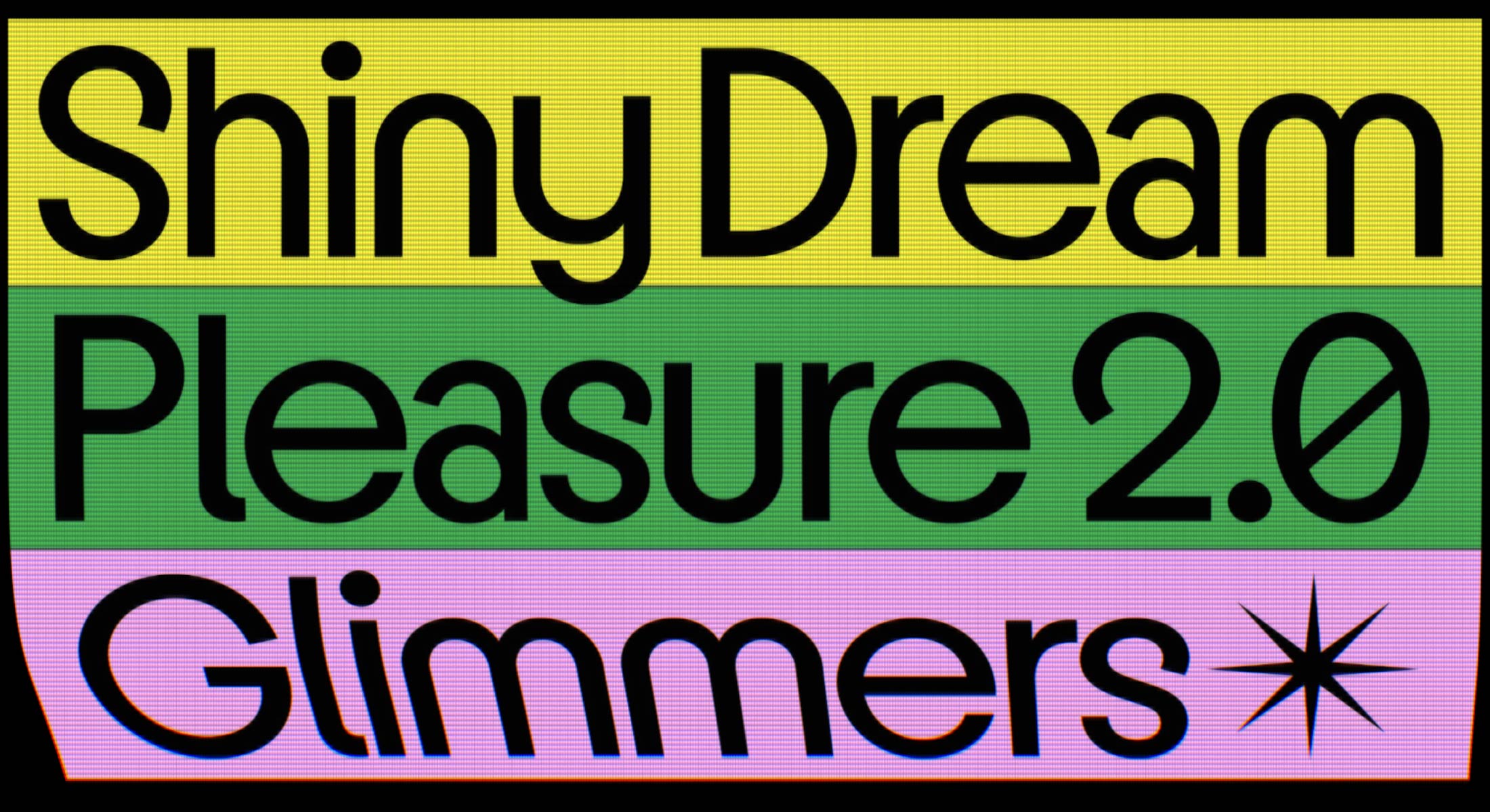
1. Sugarspark & Sugarswift by Interval Type →
Disco to the very core, Sugarspark and Sugarswift combine to create a duo that goes beyond the typical 1970s homage. Taking inspiration from the Bauhaus, Kabel, and Avant Garde (including all of those amazing phototypeset ligatures), this superfamily is capable of handling both headlines along with any amount of body copy you can throw at it.
Sugarspark has seven display weights and a ton of OpenType features, while Sugarswift adds italics and genuine workhorse qualities. With support for both Latin and Cyrillic, Interval Type released an international superfamily worth using in any decade.
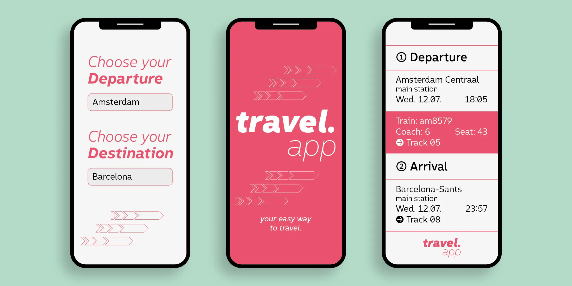
2. Conviva by Fincker Font Cuisine →
Conviva is a sans serif workhorse optimized for accessibility with looks that are not just acceptable, not just good, but great! That might seem strange to point out, but a lot of hyperlegible fonts are kind of a headache to read in practice.
Conviva has all of the accessibility features you would expect to see (open apertures, no mirror glyphs, identifiable letterforms, etc.), but my favorite feature is honestly the extensive small caps collection. It comes with punctuation, figures, an eszett, ampersand, and more. All of the little things you don't think you'll need until you do!
Conviva is an accessible workhorse that won't let you down.
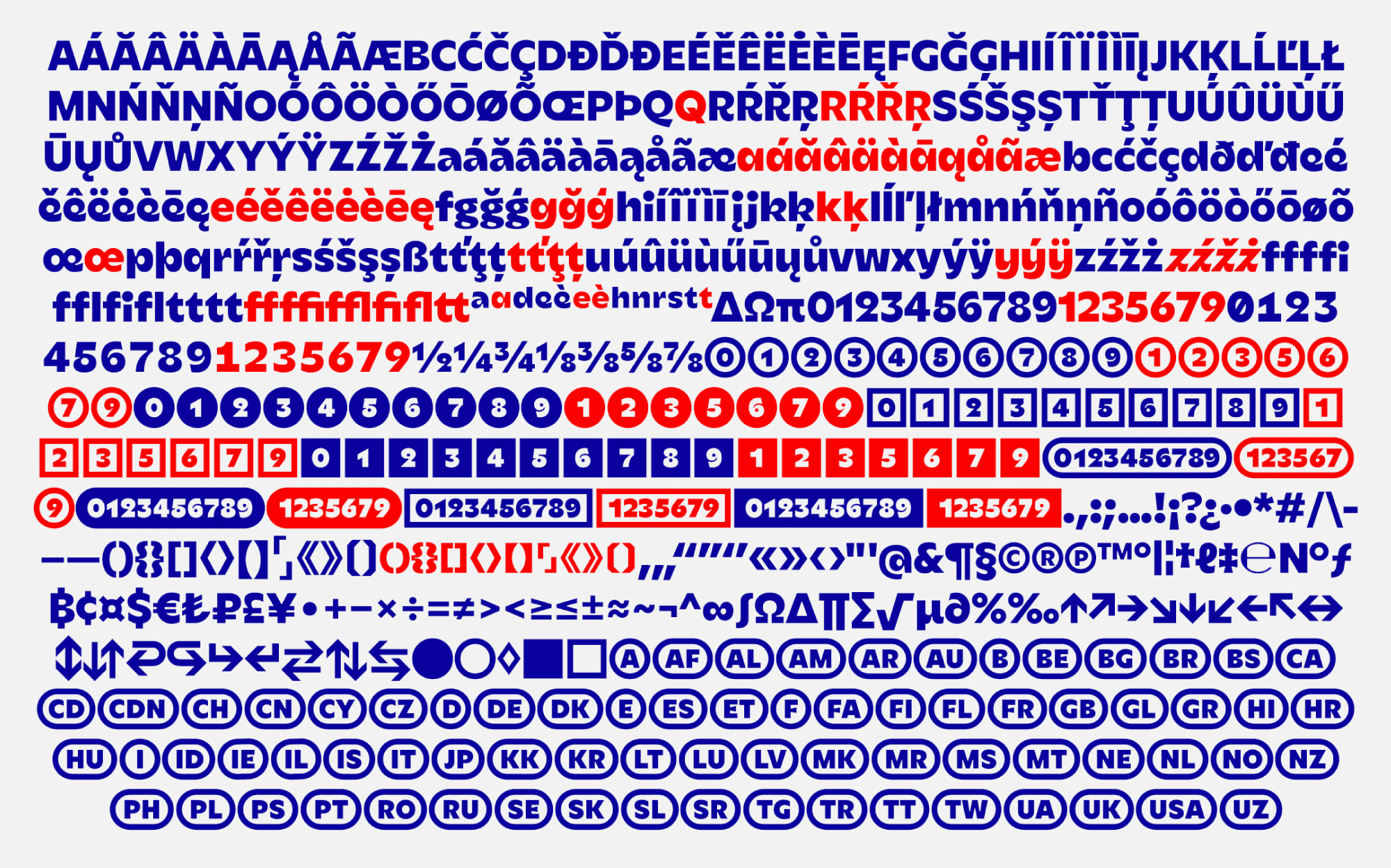
3. ENTX Airbag by En Travaux →
Airbag might be the most difficult typeface this month to describe. At lighter weights and lower contrasts, it comes across as characterful enough, but when you slide that variable axis all the way to Black, Airbag becomes something else entirely. The ink traps grow, the contrast increases, and the lowercase letters begin to look like balloon animals twisted and inflated to the point they might pop!
And just when you've got a nice display font on your hands, you check the stylistic sets to find you can tone down the entire typeface in a way that makes it genuinely capable of handling body copy.
The specimens for this one will definitely grab your attention, but I would encourage you to think of this as more than a display font: there is a lot of value to be had here, if you take a second look.
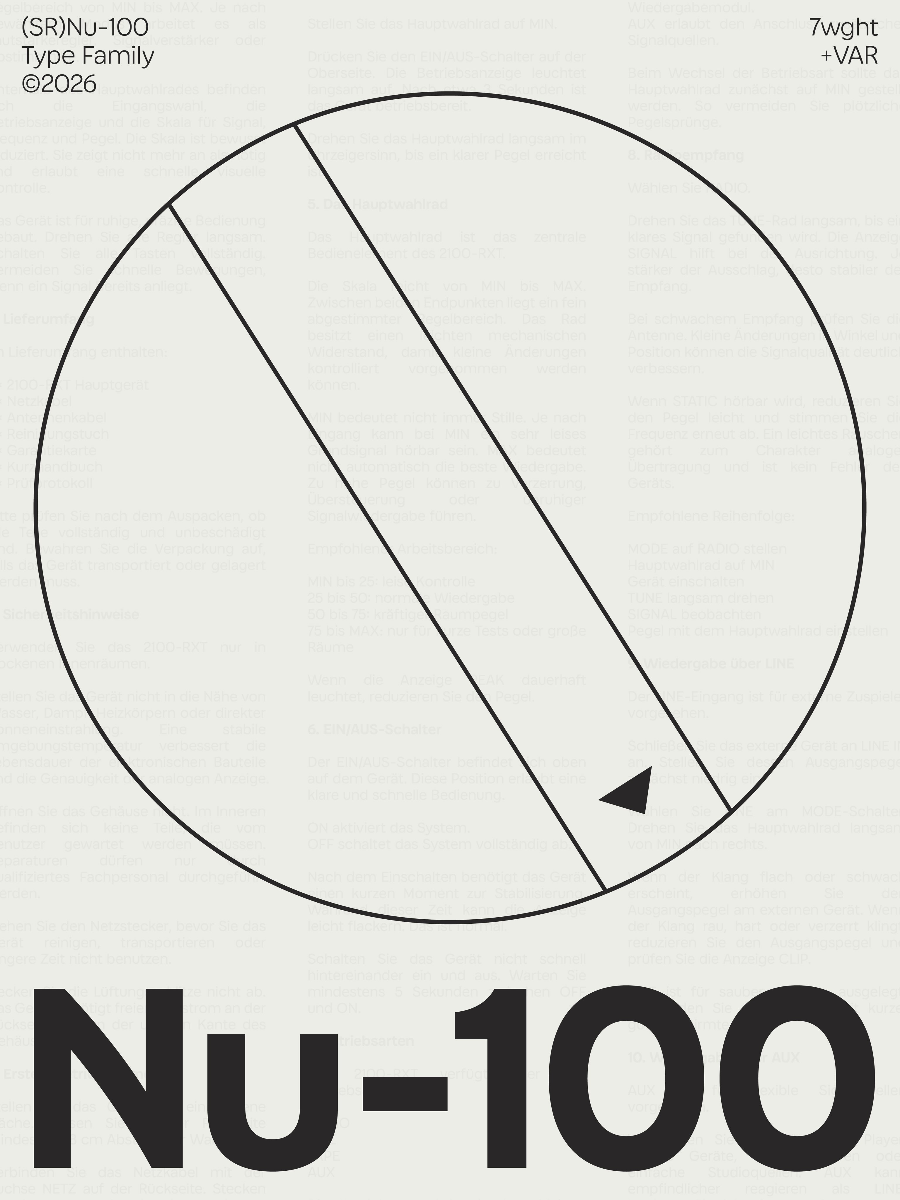
4. Nu-100 by (SR)Type →
Inspired by the techno-optimism of the 1960s to 1980s, Nu-100 manages to capture a feeling you didn't know you longed for. There is a real intangible asset included with this typeface that is not easily quantified or defined, but is absolutely felt by the reader.
I particularly love the subtle curves. There are arching crossbars and bowing stems that add warmth and playfulness to the typeface that you likely don't associate with "technology typefaces" in 2026.
These days we see a lot of tech companies begging for your trust with serif typefaces. Nu-100 doesn't have to beg. It's confident in what it is, and that's far more trustworthy than putting on a suit to be taken seriously.
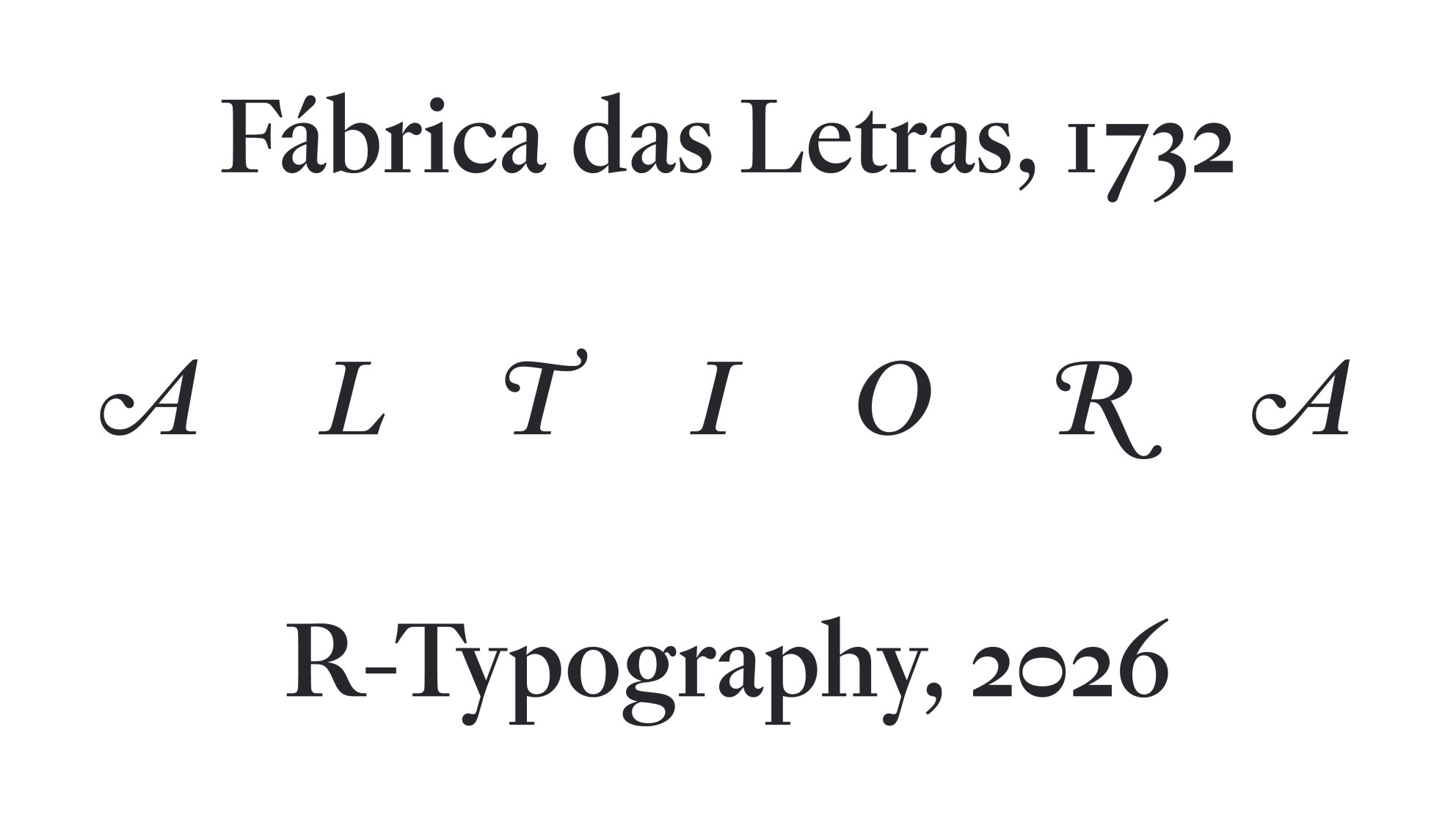
5. Altiora by R-Typography →
I'm going to cut to the chase with this one: I am in love with the combination of bracketed serifs on the capitals (and small caps) and unbracketed lowercase serifs. It's not something that should work, but somehow it does.
Altiora is a revival of typefaces cut by Jean Villeneuve in the early 1700s. It remains faithful to the original, while objectively improving on the typeface with the benefit of 300 years of advancements in technology.
There are three optical sizes, three weights, and italics for a total of 18 styles. I point out that last part to note that this isn't just some revival with a gimmick. This is a serious, serif workhorse with beautiful forms and unique features.
It was good enough for Portuguese royalty in 1732, and it's even better in 2026.
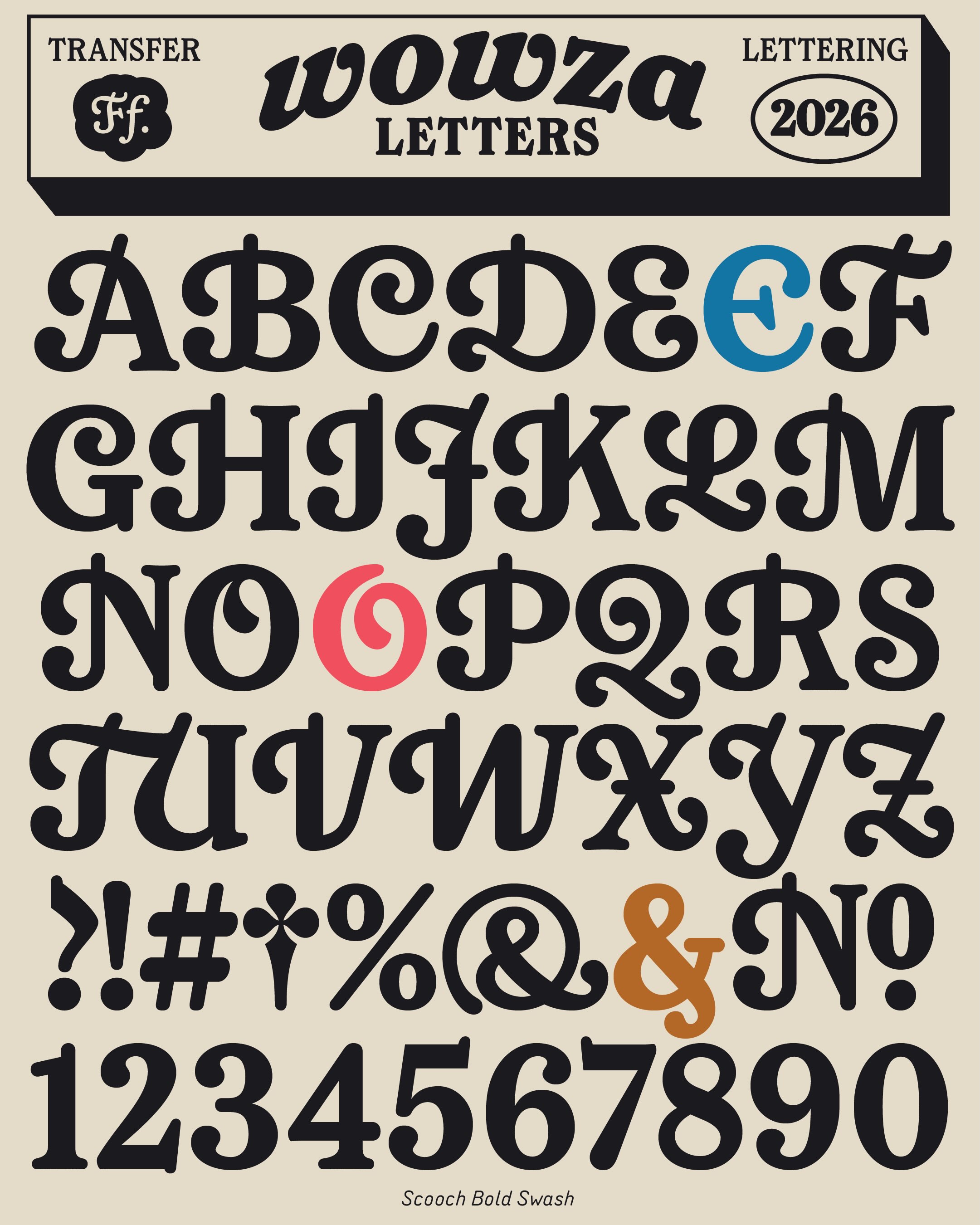
6. Scooch by East of Rome →
Scooch is the comfiest, coziest typeface on the list this month. It's got soft, inky shapes, cupped serifs, and more swashes than you'll know what to do with.
The swashes really are a standout feature. They aren't only included in the italic capitals, like we see with many typefaces. Instead, Scooch offers a dedicated Swash family that includes uppercase, lowercase, roman, and italic swashes.
But before you start thinking of this as only a display font, let me assure you that Scooch looks equally handsome in body copy. You might not expect it, but Scooch set in regular creates an amazing reading experience.
I do wish the standard and swash families could be combined into one typeface, but that's not enough to stop me from including this in the 8 Best Fonts of October. Scooch more than earned its place on that list.
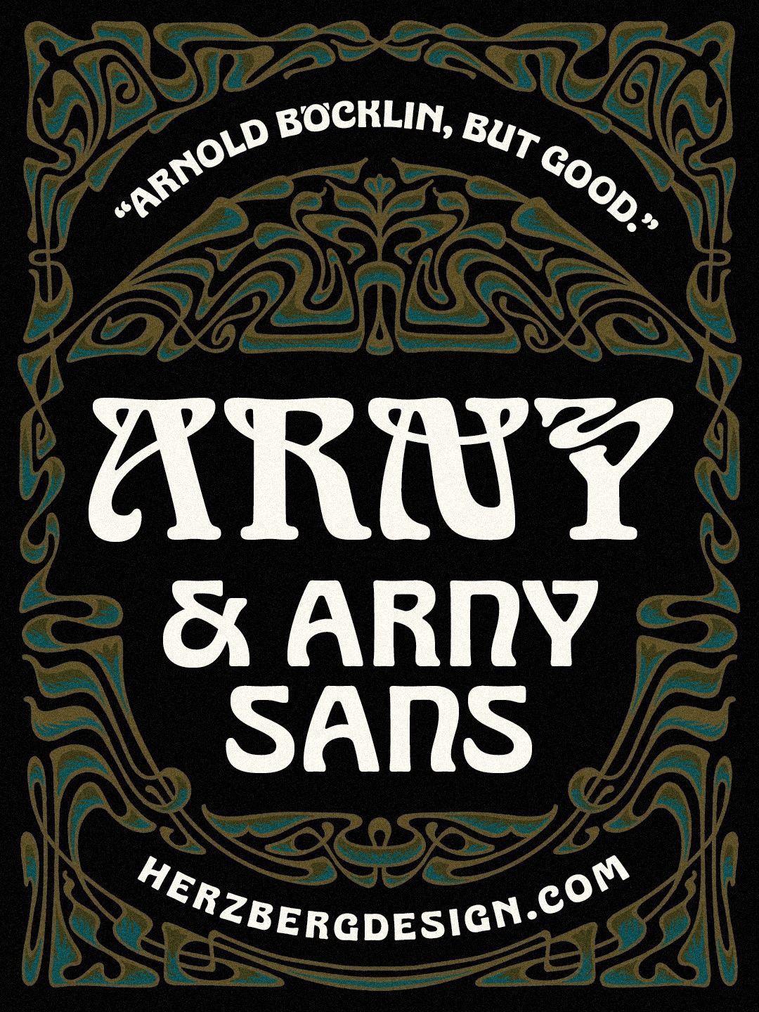
7. Arny & Arny Sans by Herzberg Design Co →
Herzberg Design Co came out swinging in October 2026. Arny and Arny Sans made this list, but Alas (a psychedelic blackletter) could have just as easily been included.
I've gone with the revival, and expansion, of Arnold Böcklin instead simply for the fact that this is now the version I expect people will be using henceforth. In the same way that most of the Hobo you see on the streets is actually OHno's Hobeaux, if we fast forward five years, when you see an Art Nouveau-inspired piece using what appears to be Arnold Böcklin at first glance, it will actually be Arny.
To further the strength of this release, Herzberg paired this revival with Arny Sans, a stripped-down variant that trades in flourish for legibility and utility, without sacrificing its character. Arny and Arny Sans have taken the Art Nouveau torch from lesser digital revivals, and we all reap the benefits.
8. PP Altera by Pangram Pangram →
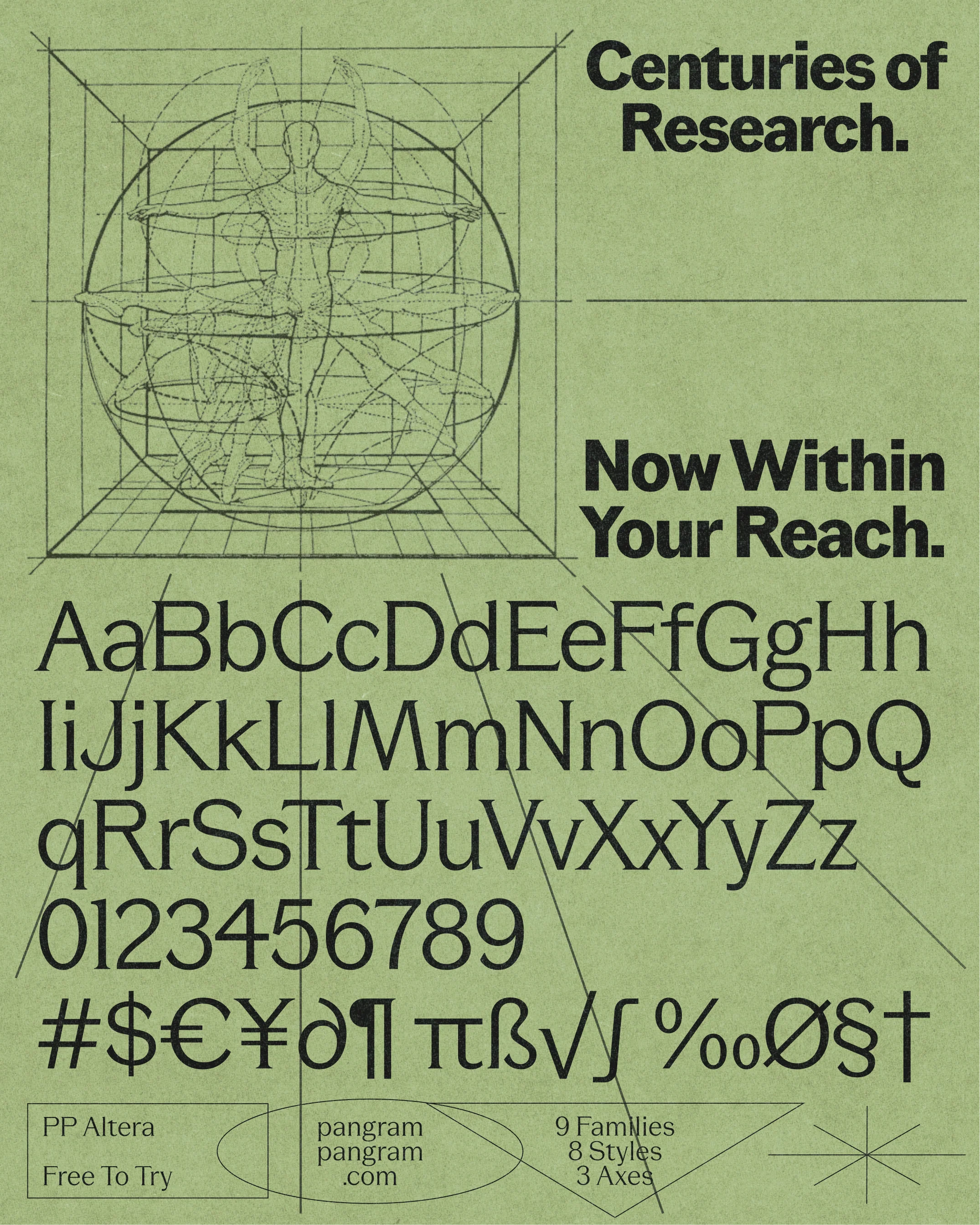
Last month we saw Tipografies making the most of variable font technology with Oscila's contrast sliders. This October, Pangram Pangram said "hold my pumpkin spice latte" and dropped Altera, a single variable font that defies all classification. It has nine subfamilies that can range from sans to serif, text to display. Three variable sliders (serif, contrast, weight) make this magic possible, and combine to produce 72 distinct instances.
One could certainly argue a typeface like Altera is destined to be a jack of all trades and master of none. On the other hand, I find it hard to deny how useful and beautiful this is going to be for editorial use, especially in the hands of a designer who has learned to make this typeface sing.
Curtis Simpson, Jectivesyoutube.com/@jectives
We also have a newsletter
Subscribe and be the first one to receive all the hot and fresh news!